How to design service business website pages that generate more enquiries
Understand what makes a visitor pick up the phone
For a service business, a website is not a brochure. It is a tool that turns casual browsers into leads. Every page should guide someone towards making contact, whether that is filling in a form, calling a number, or sending an email. The difference between a page that gets ignored and one that gets results often comes down to a handful of design choices. When you know what those choices are, you can build pages that work harder for your business.
Start with a clear value proposition
Within seconds of landing on a page, a visitor should understand what you do and why it matters to them. This is not about clever slogans. It is about stating your core offer in plain language. If someone runs a plumbing business, the headline might be "Emergency plumbing repairs across Norwich" rather than "Quality plumbing solutions". The first tells the reader exactly what to expect. The second forces them to guess. Your value proposition should sit near the top of the page, ideally in the first paragraph, and it should answer the question "Why should I choose you?" without making the reader hunt for clues.
Remove unnecessary choices
Too many options can freeze a visitor. A page that presents a menu of services, a blog sidebar, a newsletter sign-up, and a live chat widget all at once can overwhelm someone who just wants to know if you can fix their boiler. Keep the main call to action prominent. If the goal is to get enquiries, that call to action might be a button that says "Book a free quote" or "Request a callback". Place it where the eye naturally falls, usually in the top right or centre of the page. Repeat it further down, but do not clutter the page with competing offers.
Structure your contact form wisely
A contact form is often the final step before a lead reaches you. If it asks for too much information, people abandon it. If it asks for too little, you waste time following up on low-quality leads. A good balance is to request the name, email or phone number, a brief message, and perhaps a dropdown for the service they need. Keep optional fields to a minimum. Place the form above the fold on dedicated landing pages, and use a clear submit button that says what will happen next, like "Send enquiry" or "Get a response within 2 hours". Test the form yourself on a phone and a tablet. If it feels fiddly on a small screen, it will cost you enquiries.
Build trust with visible signals
People are cautious about handing over their details to a business they have not met. Trust content helps them feel safe. This includes client logos, testimonials, case studies, and any accreditations you hold. Display these near the contact form or at the bottom of the page. A short testimonial from a previous customer that mentions a specific result can be more persuasive than a generic star rating. If you have won awards or are listed in a recognised directory, show those badges. The goal is to reassure the visitor that you are a real, reliable operation.
Map the page to the customer journey
Not every visitor is at the same stage. Some are researching, some are comparing, and some are ready to buy. A single page can serve all three if it is structured well. Start with a headline and introduction that speaks to the researcher. Follow with a section that compares your service to alternatives or explains your process. End with a strong call to action and contact form for those who are ready to proceed. This layered approach means you do not lose a visitor who is further along the journey, while still giving early-stage readers the information they need to move forward.
Write copy that answers real questions
People search for services because they have a problem. Your copy should acknowledge that problem and show how you solve it. Use the language your customers use. If you are a heating engineer, your visitors might search for "boiler not heating radiators" rather than "central heating fault diagnosis". Write in the same words they use. Answer common questions directly. A frequently asked questions section near the bottom of the page can capture people who are close to deciding but have a lingering doubt. Keep the tone professional but warm. Avoid jargon that could confuse someone who is not familiar with the trade.
Optimise for speed and mobile use
A slow page kills enquiries. If a page takes more than a few seconds to load on a mobile connection, many visitors will leave before they see anything. Compress images, limit the use of heavy scripts, and choose a hosting provider that delivers fast load times. Test the page on a 4G connection and a desktop. If the layout breaks or the buttons are hard to tap, redesign the responsive elements. Mobile traffic now accounts for a large share of web visits, and a page that works well on a phone is no longer optional.
Use a single, focused goal per page
A page that tries to do everything often does nothing well. If you want enquiries, make that the primary action. Do not crowd the page with links to your blog, social media feeds, or partner sites. Each of those can send the visitor away before they have contacted you. Keep the navigation minimal on landing pages. A simple header with your logo and a phone number is often enough. The rest of the page should funnel attention towards the contact form or call button.
Test and refine based on real behaviour
Design is not a one-time task. Once the page is live, watch how people interact with it. User testing does not have to be expensive. You can ask a friend to try finding your contact details and see where they hesitate. You can look at analytics to see where visitors drop off. A high bounce rate on a landing page might mean the headline is not matching what they expected. A low form completion rate might mean the form is too long or the button is not visible. Small tweaks, like changing the colour of a button or rewording a headline, can lift conversion rate noticeably. Keep a log of what you change and what effect it has.
Watch for common pitfalls
One mistake is hiding the contact details. If someone has to scroll or click around to find your phone number or email address, they may give up. Another is using stock photography that looks generic. Real photos of your team, your van, or your previous work can build more trust than a polished image from a library. A third pitfall is neglecting the thank-you page. After someone submits a form, they should see a clear message confirming what happens next and how soon they can expect a reply. That small touch reduces anxiety and makes the experience feel professional.
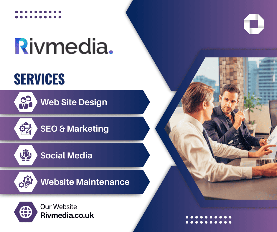
Putting all of this together takes time, but the effort pays off. A well-designed page that answers questions, builds trust, and makes contact easy will generate more enquiries than a page that looks good but ignores how people actually behave. For businesses that want expert help getting this right, Rivmedia Digital Services offers web design and digital marketing services that focus on turning visitors into leads. Their team can help structure your pages around the customer journey and optimise them for better results.
If you are working on your own site, start with one page. Pick your most important service, apply the ideas above, and measure what happens. The changes you make do not have to be dramatic. Even a small improvement in how your page guides a visitor towards contact can lead to a noticeable increase in enquiries. Keep refining based on what your visitors show you, and your website will become a reliable source of new business.
Rivmedia Digital Services is also on Instagram.
For more information about web design services that help service businesses grow, contact Rivmedia Digital Services at 37 Lewis Drive, Wiggenhall St Germans, King's Lynn, Norfolk. PE34 3FB, or call +44 1553 341334.
Ends · THELAYOUTJOURNAL